Friday 29 July 2011

MAIN dish : Part 2

I'm back ! I'm back ! I'm back to make my dead blog alive again :)
Anticipated about what I'm going to post today ? Today's post will be all about the MAIN dish . If you do not know what is that , let me repeat myself . MAIN dish is my final assignment for Digital Media. So , keep this in mine . I'm not repeating again after this.
Few weeks back , I had introduced you guys to my MAIN dish which is Redang Island or we usually called it in Malay which is Pulay Redang. For your information, I'm appointed for the activities. Activities is always my first choice. I would be able to tell how fun a place since I had visited there few years back with my family. I'm playful and adventurous enough to had explore all the activities there. Today, I will let you guys know about the layout for my activities in the website. 
Now , let us look at the overall layout of my group blog . 
By the way , my group blog's URL is http://thebimbotics.blogspot.com/  . Do pay a visit when you are free !

Overall Layout
According to the layout, all information icon will be on the left side and ACTIVITIES is fifth icon from the top . To view the activities, you gotta click on the activities link . Are you wondering what you will see inside the activities page ? Look at the general layout below . Do not assume that this is a boring layout ! It seems bore because words and pictures are not filled it . It gonna be totally different when each and every corner is fill up with colours and words. Trust me for once :)

General layout for activities
I had separated the activities into its very own link . For each of the link above, it provides you different information. The main reason , I made the layout in this way because I didn't want visitors to read a bulk of information at the same time and not having time to digest it. I made it in this way so that readers can read each activities separately with sufficient information. They do not need to scroll many times up and down to look for some particular information. 
For instance , click in snorkelling . All information about snorkelling will be displayed on the content area including a map that shows the places that are available for snorkelling . Readers will be able to plan out their best snorkelling destination before the holidays.

Example
Above are the layout for my website. Do give me some ideas or suggestions  if you guys can think of any better . Do visit my blog more often to be updated on the interesting dish :)

Have nice weekend !

Monday 18 July 2011

Retouching and enhancing the beauty

Dear all , this is what i had promised previously . To show the technique on retouching and enhancing . I'm so sorry that I always blog at night . No choice ! Extremely busy with classes, assignments and mid-terms. Fyi, I'm sick yesterday . Luckily, everything gets back to normal now.
Alright, let's go straight to the main point :)
First , let's look at the photo that I had uploaded after my layering process. I guess you guys had already forgotten how it looks like . I'm so gonna refresh your memory now !


Do you have a slight memory about this eWallpaper ? I bet you do remember this although it's not so attractive . My tutor, Miss Lydia said i didn't use much skill of Photoshop . This time round , I'm going to change the wording style of "Faculty of Management" and add on shadow to the eBee as well as the logo . Just double click on the layer and a dialogue box as below will appear.

At the dialogue box , you can see a few options on the left hand side. For instance, drop shadow, inner shadow, outer shadow and etc. You just select which style you prefer and adjust it to your own preference . As for the 3 elements I had stated above , I emphasize on drop shadow and inner shadow . That is the main reason those wording and logo aren't that clear . Remember to click on preview so that you're able to look at the adjustment .
Look at the circled wording and compare it with the original one .
After adjusting the wording , we are now moving on to enhancing and retouching. Well, my eWallpaper has nothing much to retouch on. So I will focus more on enhancing. In enhancing, I will focus on only adjustment. Adjustment will be available on the right hand icon. Just click in adjustment, and one whole set of icons will appear .

Now you know where to find all the adjustment icons. Each and every icons represents a different function. In my eWallpaper , i had used colour balance , brightness/contrast, and levels. These 3 components help me adjust the colour and brightness of the image to suit my preference .Besides that , I manual adjust the colour balance of the background building image making it a little red so it would look so ordinary and dull . Colour balance has 3 tones which include shadow, midtones and highlights. Each of this brings different effect after adjusted . Focus on image during the adjustments.

 
Drag each of it to adjust the colour intensity
Shadows&highlights
Colour balance
Next, I would like to enhance on the cloud. The cloud are just looking too pale with little clouds intensity . Now, I'm going to increase the clouds intensity by reducing the noise . people might wonder what is it has to do with noise . Curious ? Just follow the steps. Go to filter , select noise then reduce noise. The same goes to smart sharpen . Select filter , then sharpen and finally smart sharpen. As usual, dialogue box will appear for adjustment purposes.

reduce noise process
smart sharpen
That's the process of mine in retouching and enhancing . Isn't that simple ? A simple adjustment change and modify the original beauty of it . Try it out !
Now, let's have a look at my final outcome after adjustment .

Taaadaaa ! :)
That's my final outcome of adjusting everything . Like it ?
Do give me comment if you think I'm still lacking of skill or there are places that need to be improved .
I gotta sleep now . Good night all my beloved readers

Friday 15 July 2011

New chapter of the week

Hello peeps ! I'm back . Sorry for not updating the blog for almost a week . I'm a little busy with the mid terms, assignments and events. I have a good news for everyone . I learn retouching 2 weeks back . This is such as interesting and useful technique for everyone especially GIRLS . Retouching is a skill where you can get rid of all unwanted parts of an image . I love this skill so much as I can use it to get rid of all the unwanted fats that i have on the portrait image of mine . I have fat arms :((
Besides that , I also learned enhancing last week . I can now adjust and change the colour of the image as I wanted it to be . No longer dilemma with the imperfectness of the image . Awesomely happy with these 2 new skills. My lecturer told us that someone kind had uploaded an eBook for us on MMLS . So kind of this people . I can now learn everything at home by just reading those steps . Although I had to spend hours sitting there to explore, it worth it . Exploring brings me to the next door of digital world .
Alright , it's time to stop now . I shall blog the retouching and the enhancing post later on . Everything is in the progress . Be patient with me :)
 

GOOD NIGHT PEEPS . CANDY CANDY DREAMS !!

Wednesday 6 July 2011

Here comes the MAIN dish

Did my title catch your attention ? Do you have any idea what is meant by the title of this post ? Continue reading this and you will know what is this all about :)
Be patient with me . I promise this is not gonna be a super long post like the previous one.
The main dish that I was mentioning in the title is actually my final assignment of Digital Media. This assignment is 35% of my whole assessment. We are required to come out with a website of our own . All in our own preference in terms of design, contents as well as arrangement. Aren't this cool ? we can have our own website. I did took "webpage design" in my foundation. Hopefully I still remember those html code to help out my group members. 
Let's come back to the topic and not any further . Last week my tutorial group had sent a representative to grab for our favourite topic- ISLAND ! We are a little worry that we could not get this because other topics are a little unfamiliar to us. The whole bunch of us love traveling so much and so island is our first choice. Thanks GOD for loving us so much and we got it . I was real happy and surprised that we actually got it . We have 6 tutorial groups and we still manage to get it . All I can say is "Wow !! Our class rep is efficient." Thankieww Sello !
Once we got the topic, we quickly start on it . Proposal is our first step before moving into the website. I'm sorry Dr.Ken. We SERIOUSLY  didn't know that we are suppose to hand in the proposal in week 3. Luckily you're kind enough to extend the due date for us. My group name is Bimbooo and we had selected Redang Island as our theme.
The proposal is divided into a few areas. I was appointed to complete the responsibility of the proposal. In this part, we had divided it into a few sub topic which include resorts, activities and transportation. I was selected to complete the activities available at Redang Island. I'm a blur person. So, I'm worry that I wasn't on the right track. Hopefully, what I did will be accepted. *praying hard*
To begin the proposal, I did some research on a few website to get some useful and reliable information. After the long research, I realized that Redang Island is out of my expectation although I had been there few years back. When it talks about Redang Island, the first thing that comes to my mine is beach. In fact, there are many activities that can be done there. We can go for snorkeling, scuba diving, turtle watching, jungle trekking and many more. It's written on those website that Redang Island has a marine park and redang island is the biggest island in Redang Archipelago which consists of 9 island. Redang island is a sandy beach with crystal clear water and exotic marine lives. 
Below are some photos of Redang Island. Let the photos to tell you the beauty of the island .

SCUBA DIVING 
Snorkeling at Marine Park
Turtle watching
Jungle trekking
Are you fascinated by the beauty of this local island ? What are you waiting for ? Pay a visit there soon.
Appreciate the most precious gift of GOD to us. Love the nature just like how you love your beloved one

P/s : Stay tuned for more interesting updates !

Tuesday 5 July 2011

Layering

It's me again ! Here we go for another new lesson - Layering !

To be honest, I'm not so sure about layering as mine is real simple . I have no idea whether i applied all I learn or i just play with the "on" and "off" button. Hopefully my lecturer accepts my hard work . Already did it for more than 3 hours :(

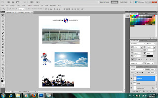
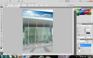
Well, i had already finalize all the photos that I would like to use for my eWallpaper. I took some photos from the previous selection and I added in 2 new photos to enhance the design of the wallpaper. As usual , i selected the part that I wanted and needed for my wallpaper. Below is my final selection.

Selection of the photo 

final selection for my eWallpaper

After doing the selection, i combined all of the photos into a complete form by adjusting the colour and position. Firstly, open a new page. A dialogue box appear and adjust the size of the paper from clipboard into international paper (A4). Next, i select one of the photo as the background photo.

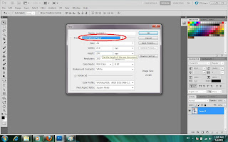
Selecting International Paper (A4)
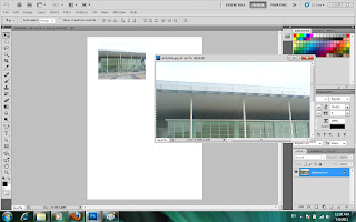
Selecting the background
 After selecting the background, go to "edit", click on "free transform" to adjust the size of the image. You can also click on the shortcut button on the keyboard which is "ctrl+t". Adjust the photo according to your own preference. As for me , i would like it to fit the screen since it's my background photo.

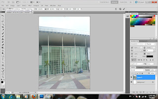
The background of my eWallpaper
The next step is to combine another photo. I felt that the sky is a little too dull for me . Therefore, I decided to change the colour of the sky by adding in another photo into it . By adding in another photo, I create a new layer. Double click on the layer to rename the layer.

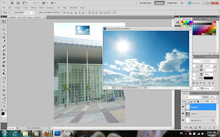
Combining the sky into the background. 
renaming the layer from layer 2 to sky
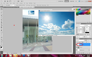

Click "ctrl+t" to adjust the size of the sky as well as the position. Move the cursor to get the your most desired position. When you're satisfied with the position, double click on the mouse to exit transform.

Adjusting the size and position of the sky to replace the original one
Done adjusting the position. After transformation
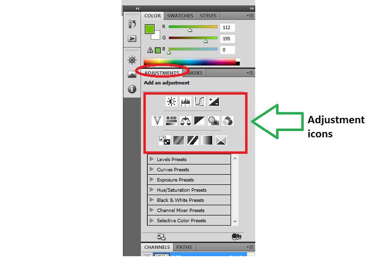
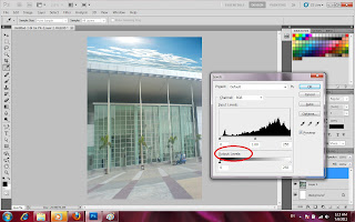
After adjusting the transformation, look at the overall picture to get satisfaction. I'm not satisfies with the colour. The sky is a little too dark. I would like to adjust the colour tone. To change the colour tone, go to "image", then click on "adjustments" and then select "levels". The shortcut buttons for this demand is "ctrl+L". A dialogue box written "levels" will appear. Move the cursor to adjust the output level for the desired colour of the image.

Adjusting the colour tone by adjusting the output levels
Next, we will move on by combining the Multimedia University logo. Rename the layer as Logo. Open the MMU logo . Click on "magic wand" to select on the photo . Make sure that the photo is in dotted line. After that, click to the "move tool" to move the selected into the main artwork. Press and hold "ctrl+T" to transform the photo.

Adding Multimedia University logo into the artwork

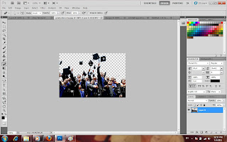
Let's continue by combining Ebee and the graduates photo. Rename each of the layers to avoid confusion. Repeat the same steps as above. Open the photo, click on "magic wand" to select the photo, click on "move tool" and drag the photo to the main artwork. After dragging in the photo, click "ctrl+T" on the keyboard to transform, which means to adjust the size and position.

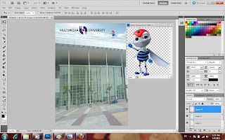
Combining Ebee into the artwork
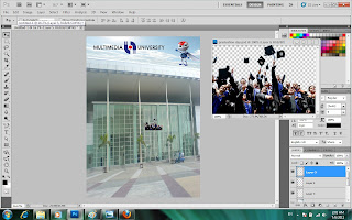
combining graduates into the main artwork

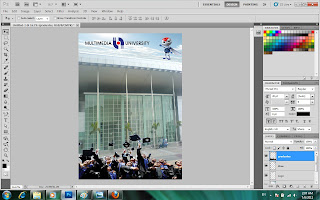
My artwork after combining the images :)
Next, we will add in some words for this artwork. Since this is a eWallpaper for an open day, details are vital for readers. Not all readers will be able to understand it by just looking at those pictures in the eWallpaper. Now, we will use the "horizontal type tool" to key in words into the eWallpaper.

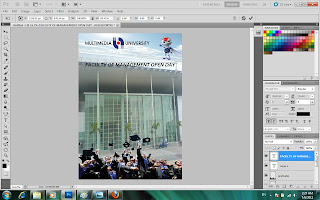
Type in "Faculty of Management Open Day" using "text tool"
I'm thinking that my eWallpaper is still lacking of information. Therefore, I add in all the necessary information using the same tool which is "horizontal text tool". Besides that, you can also adjust the font, colours and size of your wording. Observe the below picture.

Adding in text to the artwork
selecting the font type

selecting the font size
 After adding in the text, I felt like making the word more attractive. Thus, i clicked on the "rectangle tool" to draw a box around the words to make it more attractive.

Drawing a rectangular box
You must be very worry seeing the black box appear covering all the words you had type. Do not worry. This happened because the colour is not adjusted . To adjusted the colour of the box, move your cursor to the right hand side and look for "opacity". Opacity adjust the transparency of it. Towards the left side represents transparent and the right side towards the darker one.

Taaadaaa ! The box becomes transparent :)

Let's have an overview of the eWallpaper. It seems like the enquiries is in an inappropriate position. Let's move it to a better place . Move it somewhere towards the bottom part. We shall continue using the "rectangle tool" . Before we do that, we need to shift the graduates slightly higher so that those words can fit at the bottom. To move graduates, we need to click the "move tool" and go to the layer named "graduates". Click on the layer and you can now move the position of the graduates. Observe the changes made.

Moving the "graduates" slightly higher up the ground
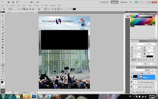
Now, we can use the "rectangle tool" to draw a box at the bottom.Adjust the "opacity" for your desired transparency.

Adding in the black rectangle box. do you see it ?

 Next, we will drag the enquiries statement to the black box. Go to "move tool" and then click on the layer named "For more enquiries...." in order for you to move the statement. If you would like to change the colour, go to "Text tool" and highlight the word and then select your preferred colour.

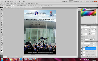
The statement is now at the bottom instead of middle

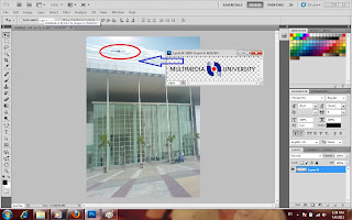
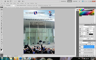
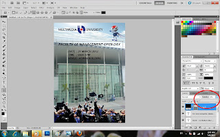
Layering has an advantage. For instance, you do not know whether to add in an extra element. You can actually make use of the "lock" button. The "lock" button can help you to preview your image. Now, I'm going to add in another layer into my artwork.

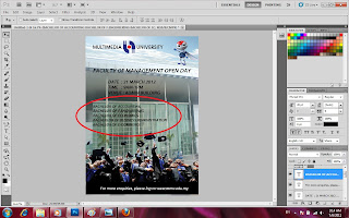
Those circle in red is the newly add-on elements.

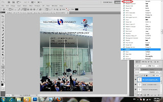
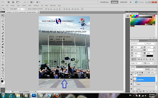
After adding in those element, i realized that i didn't like it. Therefore,, I used the "lock" to hide that layer so that it doesn't appear in the final artwork.

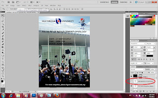
can you see that the last element added is disappear ? The lock is no longer there as well . Look at the red circle !
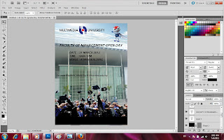
Let's look at my final outcome after layering.
Taaadaaaa :)))

This is my final outcome ! Do comment if you think there are spaces for improvement or there is something wrong or uneasy with the design. If I did something wrong in the explanation or lacking of design, do correct me. 
Thank you for your patience reading this super long post .
Have a nice day :D


A little add on :)

hello people , I found a new way of selecting :))
Instead of using just "magic wand"  to select the photo , we can as well just vector masks to help us !
This is seriously a very useful tool for me . It did help me out to check whether i did my selection properly . previously i always have problem selecting those tiny mini parts. Now, it can all be solved using vector mask and eraser tool .
Follow the step below and begin .

Step 1 : Select a photo that you would like to edit . Open the photo at the Photoshop just like below.


Steap 2: Click "magic wand" and select the part or section that you like. You can adjust the tolerance level . The higher the tolerance level, the more colours can be selected. As for the photo below, it do not have many colour tones. Therefore, i can set the tolerance at 10. If the picture involved many colours, a higher tolerance can be selected to make the selection easier.


Step 3: Click on the "move tool" to move the cursor. Move the cursor to the layer to unlock the layer . Next, press "ALT" and the "vector mask" button together. A new layer is form next to the original one . All those unwanted part is deleted and a checkered background appear just like below.


Step 4: Delete the extra layer by moving it to the rubbish bin . A dialogue box written " Apply mask to layer before removing" . Click on the OK button to apply . After applying the mask and you found out that there are still certain part you didn't like it . Do not worry . Click on the "eraser tool" to delete it .Right click on your mouse to change the size of the eraser. Those marked in the red circle are to be erased using the rubber tool.


Step 5: Here come the final outcome :)


It's just as easy as ABC ! Try it out !

Monday 27 June 2011

Let the FUN begin :)


Dear readers, I'm back . Do you miss me ?
Let's start with the exciting stories today . 2 weeks back I had my first digital media tutorial on Photoshop . It was kind of awesome and interesting . I'm definitely a computer noob. Before attending the class, I was a little worry about myself whether i will be able to catch up with everything. Surprisingly, it wasn't as bad as I thought and I find this software cool !
The first lesson was on tool selection . In that class, it teaches us how to select the tool to cut and combine photos or objects together. Can you believe that we can actually cut and combine all objects of various shapes and sizes , no matter it's big or small or round. I will be designing an eWallpaper using Photoshop. Let's see whether I did it perfectly or not :)
Btw, if you want to use Photoshop and do not know how to start, no worries. Follow me with these easy and simple steps and you will be able to start on your as well !

Step 1 : Select 5 photos 

 Firstly, I went on to select 5 photos related to MMU over the internet . After going through all the photos, I successfully selected 5 photos that I would like to use for the eWallpaper.

Step 2: Photoshop
Click on the PS icon to open the photoshop software to begin the selection of all photos. When you click on the PS icon, a dialogue box as below will appear on your screen.
Dialogue box
When you see the dialogue box, name it as you want your file to be. For instance, I name the file under my own name, SeeWei.

Step 3: Begin the lesson
In this step, you will open all the photos that you would like to combine. Go to "File" and open all the related files. Once you have open all the files, select one as the background photos. make sure the photo is not too small. if the photo is too large, re-size the photo according to your own preference.
Once you had chosen the background photo, select the next photo that you like to combine together. Click on the "magic wand" to select the part that you would like to combine and eliminate the unwanted part. The photos below are the combination of the selected photos. It shows the process where each photo is combined one by one. After the selection, drag the selected photo to the main photo where the combination take place. Look closely at the result below for reference.

Result 1
Result 2
Result 3
Result 4

Step 5: Outcome
Taadaaa ! below the is the final outcome of the selection :)


Final outcome